General Lighting Design
There is no correct meaning of individual colors, however, each color can contain common emotional
interpretations:
Red: Intensity, passion, love, bold
Green: Naturalness, wealth, fertility
Blue: Dignity, coolness. calmness, peace, trusting
Orange: Warmth, excitement, creativity
Yellow: Cheerfulness, energetic, stimulation
Green: Naturalness, wealth, fertility
Blue: Dignity, coolness. calmness, peace, trusting
Orange: Warmth, excitement, creativity
Yellow: Cheerfulness, energetic, stimulation
Purple: Pride, luxury, nobility, magical
Cyan: Calm, balance, cleanliness
Magenta: Spirituality, femininity
Cyan: Calm, balance, cleanliness
Magenta: Spirituality, femininity
It's best to choose the overall ambiance or emotion you are trying to evoke first and then select the
colors for the walls and ceilings accordingly. Subtlety goes a long way. Use pastel colors for a soft
effect and increase saturation for a stronger, more vivid effect. When using more than one color to
create a more compelling design it's typically suggested that you choose one hue for the dominant
or main color and then one or two shades as limited accent hues. When deciding which hues go
together, the color wheel is a simple tool that can help in deciding. For Artwork and Task lighting, we
generally recommend using Tunable White tones.
Use Layers of Lighting
Task Lighting
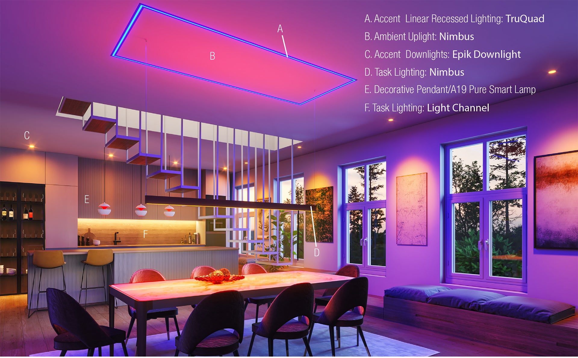
Task lighting is direct illumination used specifically for certain tasks. It provides the right amount of light to support activities like computer work, reading, cooking, dining, makeup application, and shaving. Task lighting should increase visibility in each workspace helping to illuminate small details, eliminate any shadows that may be a nuisance, and reduce strain on the eyes. Using tunable white with your task lighting can be an effective way of promoting a healthy Circadian Rhythm which can enhance your alertness during the day and help your body prepare for restful sleep at night. Optimized Circadian Stimulus can be achieved by setting the color temperature to 6500K in the early morning, 4000K-3500K mid-day, 3000K-2700K in the afternoon, and 2400K-1500K as the evening progresses and you prepare for sleep.
Task lighting is direct illumination used specifically for certain tasks. It provides the right amount of light to support activities like computer work, reading, cooking, dining, makeup application, and shaving. Task lighting should increase visibility in each workspace helping to illuminate small details, eliminate any shadows that may be a nuisance, and reduce strain on the eyes. Using tunable white with your task lighting can be an effective way of promoting a healthy Circadian Rhythm which can enhance your alertness during the day and help your body prepare for restful sleep at night. Optimized Circadian Stimulus can be achieved by setting the color temperature to 6500K in the early morning, 4000K-3500K mid-day, 3000K-2700K in the afternoon, and 2400K-1500K as the evening progresses and you prepare for sleep.
Accent
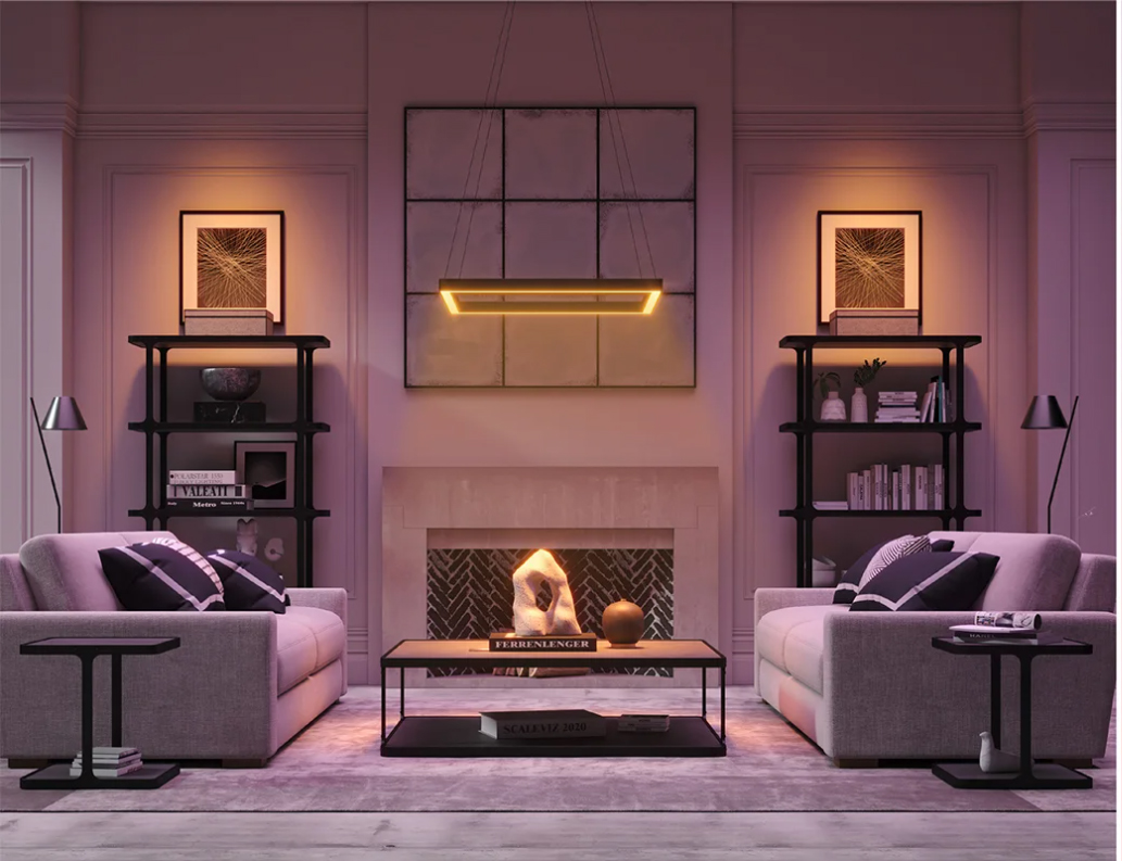
Accent lighting focuses on certain points of interest as in artwork and architectural features. Ideally the light source is hidden, glare is non-existent, and the usable light is all that is seen which creates a dramatic effect on the item or feature that they accent. Pick the color of light that best enhances the artwork. Warmer colors will bring out the vibrancy of reds, oranges, and yellows but will dull cool colors. Cool bright whites will enhance blues and greens, but make warm colors dull. You may try different tunable white temperatures as the day progresses. For special effects, you may want to add RGB to create something new.
Accent lighting focuses on certain points of interest as in artwork and architectural features. Ideally the light source is hidden, glare is non-existent, and the usable light is all that is seen which creates a dramatic effect on the item or feature that they accent. Pick the color of light that best enhances the artwork. Warmer colors will bring out the vibrancy of reds, oranges, and yellows but will dull cool colors. Cool bright whites will enhance blues and greens, but make warm colors dull. You may try different tunable white temperatures as the day progresses. For special effects, you may want to add RGB to create something new.
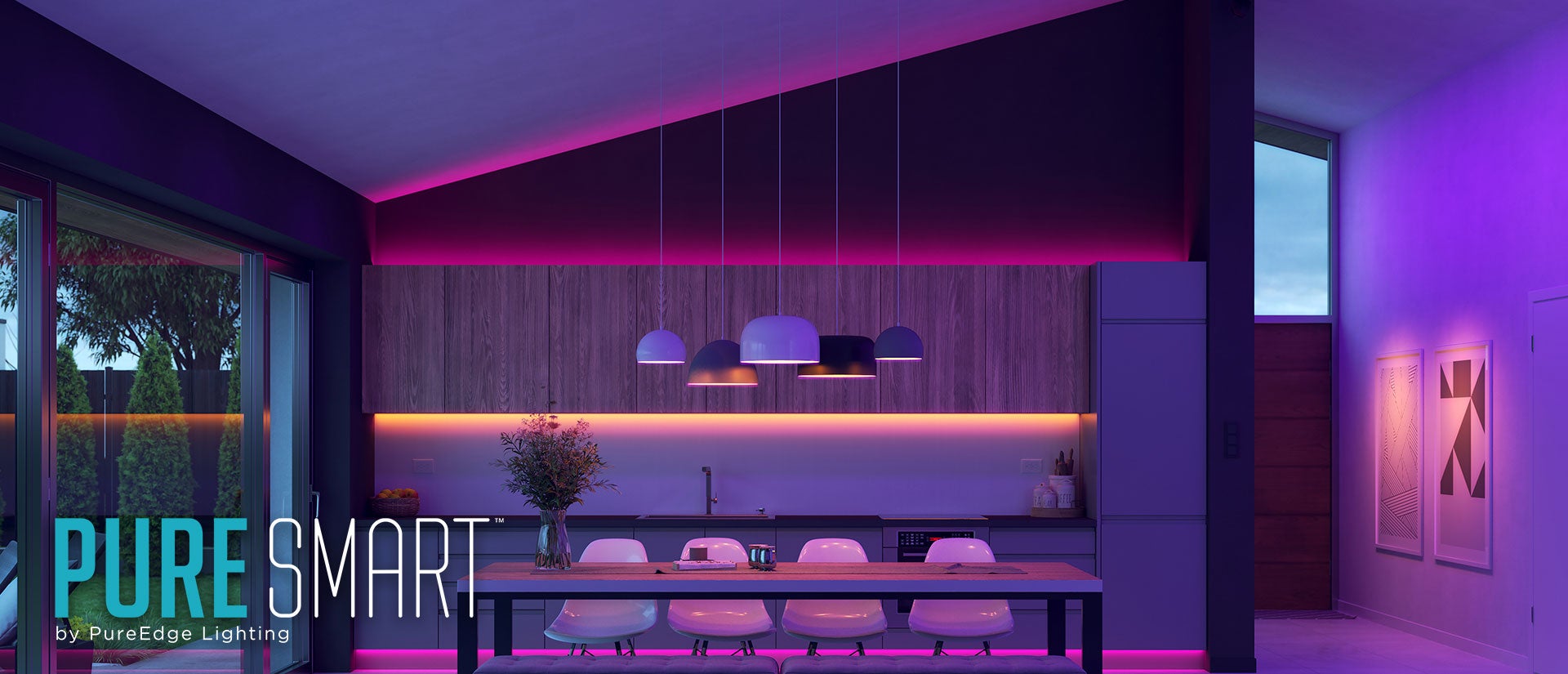
Decorative
Indoor decorative lighting gives a room or space its own personality and style. As with all of the different layers that have been mentioned, be sure to take into account the fixture style, color temperature, and beam spread to achieve the effect that you have in mind. In decorative fixtures with replaceable light sources, be sure to consider either a warm dim LED or one of the TruColor bulbs from Pure Smart (A19, A21, BR30, PAR38, B11) as the color tuning options multiply the impact and personality of the fixture exponentially.
Indoor decorative lighting gives a room or space its own personality and style. As with all of the different layers that have been mentioned, be sure to take into account the fixture style, color temperature, and beam spread to achieve the effect that you have in mind. In decorative fixtures with replaceable light sources, be sure to consider either a warm dim LED or one of the TruColor bulbs from Pure Smart (A19, A21, BR30, PAR38, B11) as the color tuning options multiply the impact and personality of the fixture exponentially.
Ambient
Ambient lighting provides uniform levels of illumination over the entire space independent of the other light sources. It will act as the base layer of lighting. Good ambient lighting can make a space feel more inviting, and even make a room feel larger. It should help bring our focus to the areas of importance in the room. This is a great application for Pure Smart Downlights, linear products, and in retrofit lamp options in TruColor RGBTW.
Ambient lighting provides uniform levels of illumination over the entire space independent of the other light sources. It will act as the base layer of lighting. Good ambient lighting can make a space feel more inviting, and even make a room feel larger. It should help bring our focus to the areas of importance in the room. This is a great application for Pure Smart Downlights, linear products, and in retrofit lamp options in TruColor RGBTW.